REACT ACCESSIBILITY PLUGIN
A more comfortable web,
on your terms.
Give people control over how they read and view your React application—with 32 customizable display and assistive controllers, bundled Manrope typography, accessible full-page modals, external mobile reading-aid nudges, 8 profile presets, and local persistence.
A composable React library. Personal to every visitor. Zero telemetry.
npm install accessibility-plugin-react
YOUR APP. THEIR PREFERENCES.
MAKE YOURSELF COMFORTABLE
Less explaining.
More experiencing.
Open the blue widget button and make this reading space your own. The sandbox runs in an isolated document, demonstrating real typography scaling, color adjustments, audio synthesis, and structure navigation.
Loading the demo… Open it directly if the frame does not load.
Scale font size, line height, word spacing, and sync bundled Manrope, Atkinson Hyperlegible, or OpenDyslexic UI fonts.
Activate external 44px Reading Guide/Mask nudge arrows, or hide decorative images and HTML5 videos cleanly.
Explore 8 profile presets, saved backups, Dictionary lookup, Page Navigator, and Shortcuts in responsive modals.
Resize the 460px desktop panel via corner handle or keys, drag the button cleanly, or expand Experimental Prototypes.
The reading sandbox demonstrates library effects on real typography, images, video and form controls.
A PERSONAL TOOLKIT
32 ways to adjust.
One easy way back.
01 / TEXT & TYPOGRAPHY LAYOUT
Find your reading rhythm.
Adjust type scale, line heights, letter and word tracking, and high-legibility typefaces. Each preference combines seamlessly without breaking component layout bounds.
- Text size50–200% · 10% steps
- Scale text and its associated line heights together, including explicit pixel sizes. A reflow-safe reading adjustment separate from browser zoom.
- Line height50–200% · 10% steps
- Independently scale existing line height to give each line the breathing room you prefer without breaking component bounds.
- Letter spacing0–10 pixels
- Open up the space between characters. Zero cleanly restores the application’s original typography.
- Word spacing0–10 pixels
- Expand or compress horizontal spacing between words to facilitate lexical segmentation for readers with dyslexia.
- Paragraph spacing0–20 pixels
- Increase vertical rhythm and separation between paragraphs to improve scannability and structural parsing.
- Text alignmentAll five choices
- Keep original author alignment, or choose left, center, right, or justified. The comfortable choice belongs to the reader.
- Font familyManrope default + accessible fonts
- Defaults plugin UI to bundled variable Manrope (SIL OFL 1.1) with zero external font requests, and synchronizes changes to Atkinson Hyperlegible, OpenDyslexic, sans-serif, serif, or monospace across both page and widget UI.
02 / COLOR, CONTRAST & VISIBILITY
A clearer way to see.
Soften colors, maximize definition, or apply curated high-contrast palettes. Centralized filters work together cleanly without distorting widget controls.
- Contrast modesOriginal + 7 adjustments
- Reduced at 0.5x; increased at 1.25x, 1.5x, and 2x; plus yellow-on-black, white-on-black, and blue-on-yellow palettes.
- Smart contrastTargeted ratio analyzer
- Research prototype that calculates background relative luminance per element and selectively adjusts tokens to target WCAG AA 4.5:1 / 3:1.
- SaturationOriginal · 20% to 200%
- Turn down color intensity for light sensitivity or boost it for vividness, while keeping the option to return to original colors.
- Invert colorsTargeted inverted view
- Invert supported page content, including imagery and media, without altering the widget’s own control panel or portals.
- GrayscaleLess color, more focus
- Remove visible color differences. Underlying saturation remains saved and returns cleanly when grayscale is turned off.
- Highlight linksUnderline + 4 treatments
- Emphasize hyperlinks with the default underline highlight, yellow-on-black, blue-on-yellow, or high-contrast black-on-white.
- Highlight focusHigh-visibility focus rings
- Render unmistakable focus indicators around active keyboard-focused interactive elements to streamline keyboard navigation.
03 / READING AIDS & DISTRACTION CONTROL
Keep your place. Clear the noise.
Reading aids follow your attention. Visibility controls remove visual noise while preserving the page’s underlying grid and document structure.
- Reading guidePointer, keyboard & external nudges
- A horizontal tracking line follows pointer or focus, while floating 44×44px ↑/↓ controls appear outside the panel so touch and mobile readers can scroll line-by-line without reopening the menu.
- Reading maskSpotlight window + external nudges
- Dims surrounding content around an adjustable focus window, pairing live pointer tracking and Alt+Arrow hotkeys with external 44×44px ↑/↓ controls outside the panel.
- Larger cursorHigh-contrast pointer
- Make the cursor easier to locate on cursor-based devices with high-contrast SVG styling and automatic native fallbacks.
- Hide imagesDeclarative + preserves gradients
- Conceals decorative <img> elements and background image URLs while preserving layout dimensions, informative diagrams, CSS gradients, and plugin icons.
- Hide videosHTML5 video & embed suppression
- Hides HTML5 <video>, animated canvas players, and recognized YouTube/Vimeo embeds while preserving document flow. Audio playback continues unless muted by the visitor.
- Reduce motionAnimation suppression
- Stop nonessential CSS animations, smooth scrolling transitions, and video autoplay for vestibular and motion sensitivity.
- Reading modeDistraction-free article view
- Extract clean main article content into a focused reader modal with estimated reading time and word count.
04 / ASSISTIVE SPEECH, AUDIO & VOICE
Hear the page. Speak your commands.
Client-side Web Speech APIs provide privacy-first assistive audio. Zero audio recordings, zero cloud processing, and zero external network requests.
- Read-Aloud TTSSentence-level speech synthesis
- Natural browser-native text-to-speech with play, pause, stop, sentence tracking, floating 44×44px playback bar controls, and rate, pitch, and voice selection.
- Voice navigationHands-free speech commands
- Research prototype inside the collapsible Experimental group matching spoken phrases (e.g., "increase text", "high contrast", "reset") via Web Speech Recognition.
05 / NAVIGATION, STRUCTURE & TOOLTIPS
Navigate structure. Discover context.
Explore landmarks, headings, and accessible shortcuts inside spacious full-page modals with standardized close controls and focus management.
- Page navigatorFull-page outline & active sync
- Scans H1–H6 headings, ARIA landmarks, and links in a full-page ModalDialog with search clearing, active item highlighting, and safe host focus transfer.
- Accessible tooltipsWCAG 2.1 SC 1.4.13 compliant
- Interactive tooltip overlay that is dismissible with Esc, hoverable without disappearing, and inherits active plugin typography.
- Keyboard shortcutsHotkeys & collision checks
- Full-page modal displaying widget shortcuts, category filtering, collision-checked access key remapping, and escape-to-cancel protection.
06 / PROFILES, PRESETS & DATA PORTABILITY
Curated starting points. Total user control.
Eight accessibility profile presets provide curated defaults in a spacious responsive modal. Create custom presets and export validated JSON configurations across devices.
- 8 Profile presetsNon-medical starting points
- Curated configurations for Motor, Blind/Screen Reader, Color Blind, Dyslexia, Low Vision, Cognitive, Seizure, and ADHD needs inside a full-page comparison modal.
- Deterministic overridesZero settings lock-in
- Custom changes made on top of a profile are preserved. Switching profiles or reverting from the active card restores defaults cleanly without data loss.
- Custom presetsSave & load personal styles
- Create, name, and switch between multiple saved preference configurations directly within the Presets modal.
- JSON Import & ExportValidated backup & portability
- Export preference sets as schema-validated JSON files or restore saved backups across devices with strict input sanitization.
07 / INTEGRATION, LOCALIZATION & DIAGNOSTICS
Developer tools. Global reach.
Built for enterprise production environments. Clean Light 460px desktop-resizable shell, FeatureGroup & ModalDialog primitives, scoped effect targeting, strict CSP nonces, open Shadow DOM traversal, 8,000-node DOM scaling, late web font metrics, translation adapters, and diagnostics.
- Scoped effectseffectScope target
- Scope adjustments to a CSS selector (e.g. "#main-content"), HTMLElement, or React ref. Isolates CSS filters from fixed headers and navbars.
- Strict CSP noncenonce prop
- Propagates cryptographic nonces to dynamically injected stylesheets for strict Content Security Policy environments without unsafe-inline.
- Shadow DOM traversalWeb Components
- Traverses open shadow roots (mode: "open") to apply typography, spacing, and color adjustments across custom Web Components.
- 8,000-node DOM scalingIncremental batching
- Doubled capacity with incremental mutation batching to prevent FOUC on large documents without full-document teardowns.
- Web font metric refreshdocument.fonts
- Automatically detects late-loaded web fonts via document.fonts.ready and loadingdone to refresh text scaling and line-height metrics.
- Locale packsEnglish, Sinhala, Tamil
- Built-in i18n dictionaries with fallback resolution for interface labels, controller names, and tooltips.
- Translation adapterConsent-gated host translation
- Pluggable translation interface with widget/form protection, status banners, live language switching, and offline lexicons (si, ta, es, fr, de, ja, zh).
- Dictionary lookupAccessible glossary modal
- Full-page dictionary modal covering core accessibility concepts ("voice", "read aloud", "translation", "landmark") with typo suggestions and zero network calls.
- Feature groups & menuConfigCollapsible sections
- Group built-in or custom controls with FeatureGroup (including collapsible prototypes) or configure via declarative menuConfig schemas.
- Diagnostics harnessDevelopment-time a11y audit
- Automated checks inspecting provider mounting, storage availability, CSP directives, heading hierarchy, and CSS filter stacking contexts.
- Event callbacksPrivacy-safe telemetry hooks
- Optional lifecycle callbacks (onFeatureChange, onReset, onWidgetToggle) with sanitized, non-identifying payload signatures.
Change your mind. Start fresh.
Reset display settings restores defaults—including registered custom preferences—while keeping your saved button position. The panel stays open, so you can see the result.
Palette choices are preferences, not a guarantee of contrast for every rendered element. Grayscale removes visible color differences while active; retained saturation returns when it is turned off.
STARTING POINTS · USER CONTROLLED
Eight accessibility profiles.
Suggested presets, never locked in.
Preferences are personal. Rather than rigid medical categorization, these profiles provide curated starting suggestions with deterministic overrides. Custom changes are preserved even when switching presets.
Motor Impaired
Motion & Oversized TargetsSuppresses nonessential animations, activates prominent focus rings, enables accessible tooltips, and enforces minimum 48×48px oversized touch targets (WCAG 2.5.8).
Blind / Screen Reader
Semantics & Read-AloudEmphasizes semantic landmark navigation, heading hierarchy exploration, and activates browser-native Read-Aloud text-to-speech.
Color Blind
High Contrast & Link CuesApplies targeted high-contrast palette adjustments and non-color-only link indicators without distorting illustrations or photographs.
Dyslexia
Legibility & SpacingApplies dyslexia-friendly typography (OpenDyslexic / Atkinson Hyperlegible), generous line, word, and paragraph spacing, and a horizontal tracking ruler.
Low Vision
Reflow Scaling & CursorScales text up to 200% with reflow-safe line heights, high-contrast enlarged SVG cursor, and prominent focus indicators.
Cognitive & Learning
Focus & Distraction-FreeActivates distraction-free reading mode, simplified layout structure, reading mask dimming, and inline dictionary lookup.
Seizure & Epileptic
Motion Safety & SaturationInstantly halts CSS animations, transitions, and video autoplay, while softening color saturation to eliminate visual triggers.
ADHD
Spotlight & OrganizationDims peripheral visual distractions with a focused reading mask and provides a pointer-tracking reading guide for steady reading flow.
Zero medical profiling or data capture. Presets are purely local UI conveniences. The package never assumes that everyone with a given condition requires identical settings, and turning off a profile cleanly restores baseline preferences.
A WIDGET THAT MAKES ROOM
Right where
you want it.
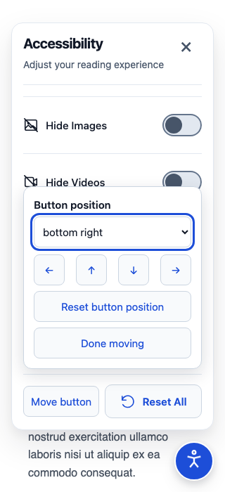
Drag the circular blue trigger out of the way. Or skip dragging entirely: choose one of four corners, use the explicit arrow controls, or move with Alt + arrow keys.
- The last completed position is remembered and adapts when the viewport changes.
- Cancelling a drag never doubles as a click to open the panel.
- Reset button position is separate from display reset.
Keyboard and click alternatives make dragging optional.
SMALL SCREENS · OVERSIZED TARGETS
The tools scroll.
The essentials stay.
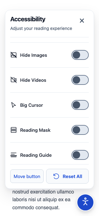
Desktop users start with a comfortable 460px panel and can resize horizontally via the corner handle or keyboard arrows, while mobile and touch viewports stay responsive down to 320px and 400% zoom with fixed Close, Move, and Reset actions.
Oversized Controls Mode: Set largeControls={true} to guarantee minimum 48×48px interactive touch targets across every button and slider, adhering to WCAG 2.5.8 recommendations.
The panel is non-modal: keep interacting with the page without a focus trap. Closing it returns focus to the trigger, while your preferences continue to apply.
PREFERENCES, WITHOUT THE FRICTION
Feels familiar.
Every time you return.
Preferences and widget placement are stored locally in the visitor’s browser. They survive closing the panel and ordinary route changes when your application keeps the provider mounted.
Local by design
The library doesn’t transmit preferences, require accounts or introduce preference analytics. Your hosting application’s own analytics are separate.
Configurable storage modes
Choose storage="local" for persistent visits, storage="session" for shared kiosks, or storage="none" (or persist={false}) for in-memory use only.
Reversible effects
Change, reset or remove the provider to restore the host properties the library owns, while respecting unrelated application styling.
BUILT FOR REACT COMPOSITION
Your app.
Your composition.
Pick the controls you need. Arrange them in JSX. Keep one provider at the persistent application root, alongside your content rather than mounting a new one on every route.
Owns preferences, persistence and effects.
Opens the visitor’s movable widget.
Contains the controllers you choose.
Start with a few thoughtful controls.
Install the package, import the stylesheet explicitly and add your widget near the root. One provider, one button/list pair per document.
npm install accessibility-plugin-react- React 18/19 integration
- TypeScript declarations
- ESM and CommonJS builds
- Server-rendering support
- No runtime dependencies beyond React peers
import {
  AccessibilityPlugin,
  AccessibilityButton,
  AccessibilityList,
  FontSizeController,
  ContrastController,
  ReadingGuideController,
  ResetController,
} from 'accessibility-plugin-react';
import 'accessibility-plugin-react/style.css';

export function AccessibilityWidget() {
  return (
    <AccessibilityPlugin
      storage="local"
      statementUrl="/accessibility-statement"
      largeControls={false}
    >
      <AccessibilityButton />
      <AccessibilityList
        title="Display preferences"
        description="Choose the reading view that works best for you"
        closeLabel="Close preferences"
      >
        <FontSizeController />
        <ContrastController />
        <ReadingGuideController />
        <ResetController />
      </AccessibilityList>
    </AccessibilityPlugin>
  );
}
See the full-control composition (32 controllers)
import {
  AccessibilityPlugin,
  AccessibilityButton,
  AccessibilityList,
  FontSizeController,
  LineHeightController,
  LetterSpacingController,
  WordSpacingController,
  ParagraphSpacingController,
  TextAlignController,
  FontFamilyController,
  ContrastController,
  ContrastModeController,
  SmartContrastController,
  SaturationController,
  InvertColorsController,
  GrayscaleController,
  LinkHighlightController,
  HighlightFocusController,
  ReadingGuideController,
  ReadingMaskController,
  BigCursorController,
  HideImagesController,
  HideVideosController,
  ReduceMotionController,
  ReadingModeController,
  TooltipsController,
  PageNavigatorController,
  ProfilesController,
  PresetsController,
  KeyboardShortcutsController,
  ReadAloudController,
  VoiceNavigationController,
  TranslationController,
  DictionaryController,
  ResetController,
} from 'accessibility-plugin-react';
import 'accessibility-plugin-react/style.css';

export function AccessibilityWidget() {
  return (
    <AccessibilityPlugin
      storage="local"
      statementUrl="/accessibility-statement"
      largeControls={false}
    >
      <AccessibilityButton />
      <AccessibilityList
        title="Display preferences"
        description="Personalize your reading experience"
        closeLabel="Close preferences"
      >
        <FontSizeController />
        <LineHeightController />
        <LetterSpacingController />
        <WordSpacingController />
        <ParagraphSpacingController />
        <TextAlignController />
        <FontFamilyController />
        <ContrastController />
        <ContrastModeController />
        <SmartContrastController />
        <SaturationController />
        <InvertColorsController />
        <GrayscaleController />
        <LinkHighlightController />
        <HighlightFocusController />
        <ReadingGuideController />
        <ReadingMaskController />
        <BigCursorController />
        <HideImagesController />
        <HideVideosController />
        <ReduceMotionController />
        <ReadingModeController />
        <TooltipsController />
        <PageNavigatorController />
        <ProfilesController />
        <PresetsController />
        <KeyboardShortcutsController />
        <ReadAloudController />
        <VoiceNavigationController />
        <TranslationController />
        <DictionaryController />
        <ResetController />
      </AccessibilityList>
    </AccessibilityPlugin>
  );
}
Collapsible Feature Groups & Modal Primitives (FeatureGroup & ModalDialog)
Group controls cleanly using <FeatureGroup> (with optional collapsible and defaultExpanded props for secondary or experimental controls) and build full-page accessible views on the shared <ModalDialog> primitive.
import {
  AccessibilityPlugin,
  AccessibilityButton,
  AccessibilityList,
  FeatureGroup,
  ModalDialog,
  ReadingGuideController,
  SmartContrastController,
  VoiceNavigationController,
  TranslationController,
} from 'accessibility-plugin-react';

// Organize controls with collapsible groups and shared full-page dialogs
<AccessibilityPlugin storage="local">
  <AccessibilityButton />
  <AccessibilityList title="Display preferences">
    <FeatureGroup id="reading" title="Reading Aids" description="External 44px nudge buttons appear when active">
      <ReadingGuideController />
    </FeatureGroup>
    <FeatureGroup
      id="experimental"
      title="Experimental Prototypes"
      badge="Prototype"
      collapsible
      defaultExpanded={false}
    >
      <SmartContrastController />
      <VoiceNavigationController />
      <TranslationController />
    </FeatureGroup>
  </AccessibilityList>
</AccessibilityPlugin>;
Scoped Container Effects & Strict CSP Nonce (effectScope & nonce)
Scope accessibility adjustments to a main content region using CSS selectors (e.g. effectScope="#main-content"), an HTMLElement, or a React ref. Typography, spacing, and media adaptations target only elements inside that container. Full-page CSS filters are applied directly to the container, isolating host fixed navbars, headers, and modal overlays from CSS filter containing-block and stacking-context positioning bugs. Supply a nonce prop to inject nonces into dynamic stylesheets for strict CSP environments.
import {
  AccessibilityPlugin,
  AccessibilityButton,
  AccessibilityList,
  FontSizeController,
  ContrastController,
  ResetController,
} from 'accessibility-plugin-react';
import 'accessibility-plugin-react/style.css';

export function ScopedApp() {
  return (
    <AccessibilityPlugin
      // Target main content only, keeping fixed headers/navbars free of CSS filter containing blocks
      effectScope="#main-content"
      // Pass cryptographic nonce to dynamically injected <style> tags for strict CSP
      nonce="rAnd0m123"
      storage="local"
    >
      <header className="fixed top-0 w-full z-50">
        {/* Fixed header is completely isolated from CSS filters */}
      </header>

      <main id="main-content">
        {/* Typography, spacing, colors, and media adaptations apply here */}
        <h1>Readable and accessible content</h1>
      </main>

      <AccessibilityButton />
      <AccessibilityList title="Display preferences">
        <FontSizeController />
        <ContrastController />
        <ResetController />
      </AccessibilityList>
    </AccessibilityPlugin>
  );
}
Declarative Menu Customization (menuConfig)
Customize which controls appear, reorder feature groups, or pin essential items to the top of the panel without writing manual controller JSX.
import {
  AccessibilityPlugin,
  AccessibilityButton,
  AccessibilityList,
  FeatureMenu,
  type MenuCustomizationConfig,
} from 'accessibility-plugin-react';

// Declaratively reorder, group, or pin controllers
const customMenu: MenuCustomizationConfig = {
  version: 1,
  groups: [
    {
      id: 'quick',
      title: 'Quick Preferences',
      items: [
        { id: 'font-size', visible: true, pinned: true },
        { id: 'contrast', visible: true, pinned: true },
        { id: 'read-aloud', visible: true },
      ],
    },
    {
      id: 'reading-aids',
      title: 'Reading Aids',
      items: [
        { id: 'reading-guide', visible: true },
        { id: 'reading-mask', visible: true },
        { id: 'font-family', visible: true },
      ],
    },
  ],
};

export function App() {
  return (
    <AccessibilityPlugin menuConfig={customMenu}>
      <AccessibilityButton />
      <AccessibilityList title="Custom Preferences Menu">
        <FeatureMenu />
      </AccessibilityList>
    </AccessibilityPlugin>
  );
}
Development Diagnostics & Test Harness
Audit your integration in development environments to catch CSP issues, missing ARIA landmarks, heading hierarchy gaps, and CSS filter stacking context interference.
import { runDiagnostics, DiagnosticsHarness } from 'accessibility-plugin-react';

// Run automated development-time audits against document, CSP, and styling
if (process.env.NODE_ENV !== 'production') {
  const report = runDiagnostics({
    checkHeadings: true,
    checkLandmarks: true,
    checkCsp: true,
    checkFilters: true,
  });
  console.log('A11y diagnostics summary:', report.summary);
}

// Or mount the interactive development diagnostics panel:
// <DiagnosticsHarness defaultOpen={false} />
Integrate with Next.js App Router
Put interactive composition and custom hook callbacks in a Client Component. Your Server Component layout can render that client boundary; it does not run client hooks. Effects begin after hydration, so a brief default-style paint is possible.
// components/preferences.tsx
'use client';

// Contains the widget composition shown above.
import { AccessibilityWidget } from './accessibility-widget';
export default AccessibilityWidget;

// app/layout.tsx (Server Component)
import Preferences from '@/components/preferences';
import 'accessibility-plugin-react/style.css';
import type { ReactNode } from 'react';

export default function RootLayout({ children }: { children: ReactNode }) {
  return (
    <html lang="en">
      <body>
        {children}
        <Preferences />
      </body>
    </html>
  );
}
For ordinary React, render the widget beside application content. For Next.js Pages Router, mount it from pages/_app.tsx and import the CSS there. See the maintained setup guide.
COMPOSABLE INSIDE. CUSTOMIZABLE OUTSIDE.
Make it feel
at home.
Adapt scoped CSS variables, class names and inline styles. Choose your trigger icon, panel heading and description, and add fixed footer actions without hiding the essentials.
A little more room to read.
Page styling preview · focus and selected states stay visible
.arap-root {
  /* Accent colors */
  --arap-accent: #1e40af;
  --arap-accent-hover: #1e3a8a;
  --arap-selected: #eff6ff;
}

/* Scope overrides to the widget's portal. */
.arap-root .my-panel {
  border-radius: 16px;
}
Customize headings, icon and fixed actions
<AccessibilityButton
  className="my-trigger"
  title="Display preferences"
  largeControls={false}
  icon={<span aria-hidden="true">Aa</span>}
/>
<AccessibilityList
  className="my-panel"
  title="Make yourself comfortable"
  description="Choose the display that works for you"
  closeLabel="Close preferences"
  statementUrl="/accessibility-statement"
  largeControls={false}
>
  <FontSizeController />
  <ResetController />
</AccessibilityList>
GO BEYOND THE BUILT-INS
A preference of your own.
The useAccessibility(featureKey, defaultValue, options) hook connects custom controls to shared state. Register a stable key, validate restored values, apply your effect and return cleanup.
The provider keeps registered effects active even when the control is unmounted. They join persistence and global reset. Definitions remain fixed for the provider’s lifetime.
Read the custom preference contractimport { useAccessibility } from 'accessibility-plugin-react';
export function PageOutline() {
const { value, setValue } = useAccessibility('site:outline', false, {
validate: (next): next is boolean => typeof next === 'boolean',
apply(enabled) {
if (!enabled) return;
const previous = document.body.style.outline;
document.body.style.outline = '3px solid #1747c8';
return () => { document.body.style.outline = previous; };
},
});
return (
<button
type="button"
aria-pressed={value}
onClick={() => setValue(!value)}
>
Outline this page
</button>
);
}Give controls your application’s voice. Configure panel and trigger wording directly. For per-control labels and translations, compose named native controls with the hook and documented feature values; built-in controllers do not accept label props. Explore the public API.
THOUGHTFUL INTEGRATION
Built into a real application.
Tested in your context.
New route content can pick up active preferences while a shared provider stays mounted. Centralized effects combine filters and restore owned styles. For larger documents, profile the actual content and mutation patterns your visitors use.
Dynamic content, text measurements and larger documents
Built-in mutation batching handles documents up to 8,000 eligible DOM elements. Incremental updates eliminate flash of unstyled content (FOUC) without tearing down existing node adaptations during dynamic DOM changes. Late-loaded web fonts are automatically detected via document.fonts.ready and loadingdone event observation, remeasuring typography and line heights as soon as asynchronous web fonts settle. Host document root attributes (class, data-theme, dir, lang) on <html> and <body> are observed with feedback-loop guards so theme and direction switches refresh preferences smoothly.
Targeted scopes, iframe documents and Shadow DOM
The effectScope prop on <AccessibilityPlugin> enables scoped targeting using a CSS selector (e.g. effectScope="#main-content"), an HTMLElement, or a React ref object (RefObject<HTMLElement>). Typography, spacing, and media adaptations target only elements inside that container. Built-in effects automatically traverse open Shadow DOM trees (mode === "open"), allowing adaptations to seamlessly reach custom Web Components. For separately embedded documents, mount a dedicated provider inside that iframe document.
Content security policies and filtered fixed elements
Strict Content Security Policy is supported out of the box via the nonce prop on <AccessibilityPlugin nonce="...">, which propagates the cryptographic token to dynamically created style elements (arap-focus-highlight-style, arap-reduce-motion-style) without requiring 'unsafe-inline'. When effectScope is configured, CSS color filters (grayscale, invert, saturation) are applied directly to the scoped target element instead of <html>, completely protecting fixed headers, top navbars, dialogs, and floating overlays from CSS filter containing-block and stacking-context positioning bugs.
Speech synthesis & voice navigation privacy guarantees
ReadAloudController and VoiceNavigationController execute 100% within the user's local browser context using standard Web Speech APIs (SpeechSynthesis and webkitSpeechRecognition). Zero voice audio, audio recordings, or speech transcripts are ever transmitted to cloud servers or third-party analytics.
Host translation adapter & sensitive content protection
The pluggable TranslationController architecture strictly omits sensitive elements (password inputs, credit card fields, autocomplete tokens, and elements marked with data-sensitive) from translation batches. Translation flows require explicit visitor opt-in and provide graceful offline mock fallbacks for testing.
Comprehensive browser & assistive test matrix
Every release is published from an automated CI pipeline that tests actual npm tarball consumers across React 18 (Vite), React 19 (Tailwind), Next.js 16 (App Router / SSR), and an end-to-end Playwright browser matrix spanning Chromium, Firefox, WebKit, Mobile Safari, and Mobile Chrome with automated axe-core audits.
ACCESSIBILITY-MINDED INTERACTION
Control that stays
in the visitor’s hands.
Native controls, meaningful names and states, visible focus, comfortable touch targets and reduced-motion support. Keyboard, pointer and touch interactions work together in a responsive, non-modal panel.
Display preferences complement accessible design. They do not replace semantic content, keyboard access or accessible application workflows.
The repository documents automated feature, keyboard, reflow and widget-scoped accessibility checks across its tested browser matrix. Automated audits are not certification or a substitute for testing your application with people. Read the recorded test evidence.
A FEW GOOD QUESTIONS
The practical details.
Clear answers for thoughtful integration.
How are preferences stored?
Locally in the visitor’s browser, with validated schema restoration and zero accounts required. Choose storage="local" for long-term persistence, storage="session" for shared or kiosk computers, or storage="none" (or persist={false}) for in-memory use only. No cloud sync, external beacons, or third-party tracking.
What are Accessibility Profile Presets?
The package includes 8 profile suggestions (Motor, Blind, Color Blind, Dyslexia, Low Vision, Cognitive, Seizure, ADHD). Unlike rigid medical categorizations, these are user-editable starting presets with deterministic override logic: turning off a preset or tweaking an individual setting preserves custom choices.
What is the Oversized Controls mode?
Setting largeControls={true} on AccessibilityPlugin, AccessibilityButton, or AccessibilityList expands touch targets to 48px or larger, meeting WCAG 2.5.8 recommendations. Ideal for mobile interfaces, touchscreen kiosks, and visitors with motor control difficulties.
How does Read-Aloud Text-To-Speech work?
ReadAloudController uses the browser-native Web Speech Synthesis API to read page content out loud. It provides play, pause, and stop controls, sentence-level visual tracking, and adjustable rate, pitch, and voice selectors. No third-party audio service or audio recording is used.
What is the Voice Navigation prototype?
VoiceNavigationController is an assistive research prototype that leverages the Web Speech Recognition API to execute widget commands entirely on the client side. Spoken commands such as "increase text", "invert colors", or "open preferences" trigger actions hands-free.
How does the Smart Contrast prototype work?
SmartContrastController evaluates background relative luminance per element and selectively adjusts foreground and background color tokens to target WCAG AA 4.5:1 (normal text) and 3:1 (large text) contrast ratios while preserving brand styling wherever contrast is already sufficient.
Can I customize the menu layout and order?
Yes. The menuConfig prop accepts a declarative JSON schema enabling application owners to reorder, group, hide, or pin controllers to the top of the panel without writing manual JSX wrapper logic.
What is the Development Diagnostics Harness?
The runDiagnostics() API and DiagnosticsHarness component allow developers to audit their integration in development environments. They check for provider mounting, storage availability, Content Security Policy compatibility, semantic landmarks, heading hierarchy, and CSS filter stacking contexts.
Can I resize or collapse sections inside the widget panel?
Desktop users on >=1024px fine-pointer viewports start with a spacious 460px panel width and can drag the corner resize handle or use Arrow/Home keys to resize cleanly within viewport bounds (mobile and touch screens stay full-responsive and non-resizable). Search-heavy tools open in dedicated full-page ModalDialog overlays, while FeatureGroup lets you organize and collapse secondary or experimental sections.
Can I customize the appearance?
Yes. Scoped CSS variables (--arap-accent, --arap-selected, etc.), className, and style props let you adapt the widget to any brand. The bundled Manrope font works out of the box (including data-URI embedding in JS bundles) and synchronizes with user font changes automatically. Supply a custom trigger icon, panel title, description, and link directly to your accessibility statement using statementUrl.
Can I include only certain controls?
Yes. AccessibilityList is fully composable. Include only the controllers you need, in the exact JSX order you prefer. One AccessibilityPlugin with one button/list pair per document.
Does it work with React 18, 19, and Next.js?
Yes. Fully compatible with React 18 and 19, Next.js App Router (via Client Component boundary), Pages Router, and standard Vite/CRA apps. It exports typed ESM, CommonJS, and CSS, executing safely after client hydration with zero runtime dependencies beyond React peers.
Can I add custom preferences?
Use useAccessibility(featureKey, defaultValue, options) inside the provider. Register a stable key, validate incoming values, apply your page effect, and return a cleanup callback. Custom preferences participate in persistence and global reset.
Can I scope accessibility adjustments to a specific container (e.g. #main-content)?
Yes. The effectScope prop on AccessibilityPlugin accepts a CSS selector string (like "#main-content"), an HTMLElement instance, or a React ref object (RefObject<HTMLElement>). When configured, typography, spacing, and media adaptations target only elements inside that container. In addition, full-page CSS filters (grayscale, invert, contrast, saturation) are applied directly to the container rather than <html>, completely protecting host fixed navigation bars, headers, and modals from CSS filter containing-block and stacking-context positioning bugs.
Does the library support strict Content Security Policy (CSP) with nonces?
Yes. Pass nonce="your-crypto-nonce" to AccessibilityPlugin. The library propagates the nonce to all dynamically injected <style> tags (such as focus ring styles and reduced motion overrides), satisfying strict CSP environments without requiring unsafe-inline.
How does it handle large documents, dynamic content, and asynchronous web fonts?
The engine handles documents up to 8,000 eligible DOM elements. It uses incremental mutation batching to apply style adjustments during DOM updates without flash-of-unstyled-content (FOUC) or full-document teardowns. In addition, it listens to document.fonts.ready and font loadingdone events to automatically refresh text scaling and line-height metrics as soon as asynchronous web fonts settle.
Does it support Web Components and Shadow DOM?
Yes. The built-in effect engine traverses open Shadow DOM trees (mode === "open"), ensuring typography, spacing, and color adjustments seamlessly reach custom element internals while respecting encapsulated boundaries.
Does resetting settings move the button?
No. Reset restores display defaults (including registered custom preferences) while preserving the visitor’s chosen button position and keeping the panel open. The movement controls feature a separate "Reset button position" action.
Does hiding a video stop playback?
No. It visually hides video elements and supported embeds while preserving layout structure. Media audio continues unless muted or paused via the player controls.
Does this replace an accessibility audit?
No. Personal display preferences complement good design; they never replace semantic HTML, proper ARIA landmarks, form labeling, keyboard navigability, or human accessibility testing. Build accessible foundations first.
OPEN SOURCE. OPEN TO YOUR IDEAS.
Bring personalized reading
preferences to your React app.
A thoughtful starting point for a more comfortable experience.
npm install accessibility-plugin-react